Native Teams
How a Bold New Look Helped Native Teams Own Their Global Story
The Brief
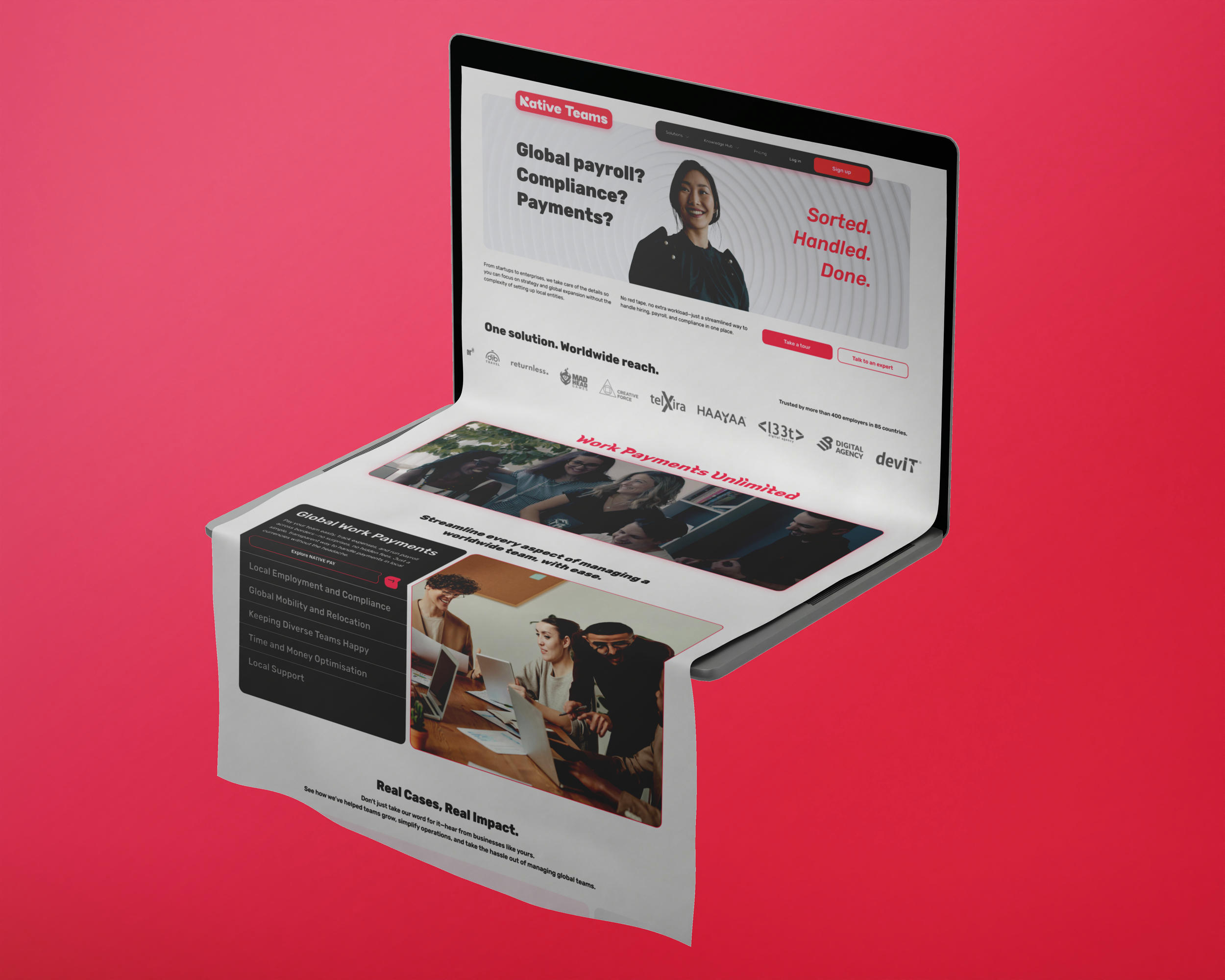
Native Teams is a global platform that helps companies manage payroll, work payments, and employment internationally.
At the time, the brand felt a bit too techy, not completely reflecting the people-first experience the platform delivered to companies managing remote teams. They needed a refreshed brand identity that matched their mission: helping businesses and the people behind them thrive in a borderless world of work.
Our challenge was to turn this complex service into a clear, emotional, and visually unified brand. One that feels modern, human, and confident.
The Strategy
First step? Understanding the users.
Native Teams serves companies with distributed teams, providing solutions that simplify workflows for both business owners and executives, as well as the teams that power them.
Together, we mapped the competition and spotted the gap: Most platforms offering similar products felt corporate, jargon-heavy, and kind of dull. To stand out, Native Teams needed a brand that led with clarity, showed heart, and stayed real.
That meant reworking not only the visuals, but also the voice and the story. The brand had to cut through complexity and radiate confidence while still feeling approachable, caring, and supportive.
The Concept
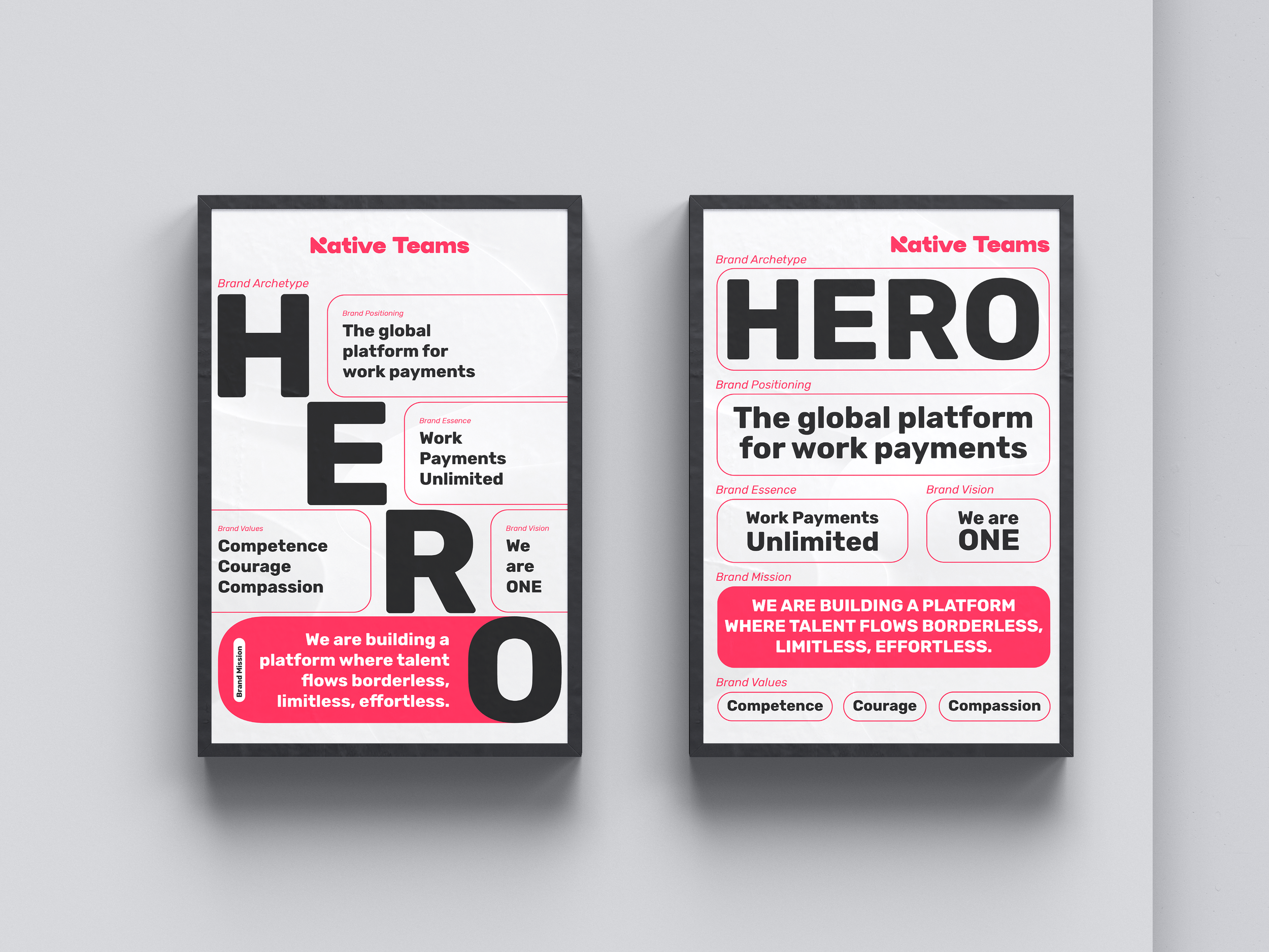
The strategy was building everything around the “Work payments made simple. Teams made happy.” idea.
The new brand identity was designed to express Native Teams’ three big personality traits:
Competent - professional and reliable, with expertise that shows.
Courageous - not afraid to challenge the status quo.
Compassionate - genuinely caring about the people they support.
Visually, the system had to feel bold but still warm. Functional, but still infused with personality. Serious about the work, but still friendly enough to make you smile.
The Execution
The refreshed identity came to life through:
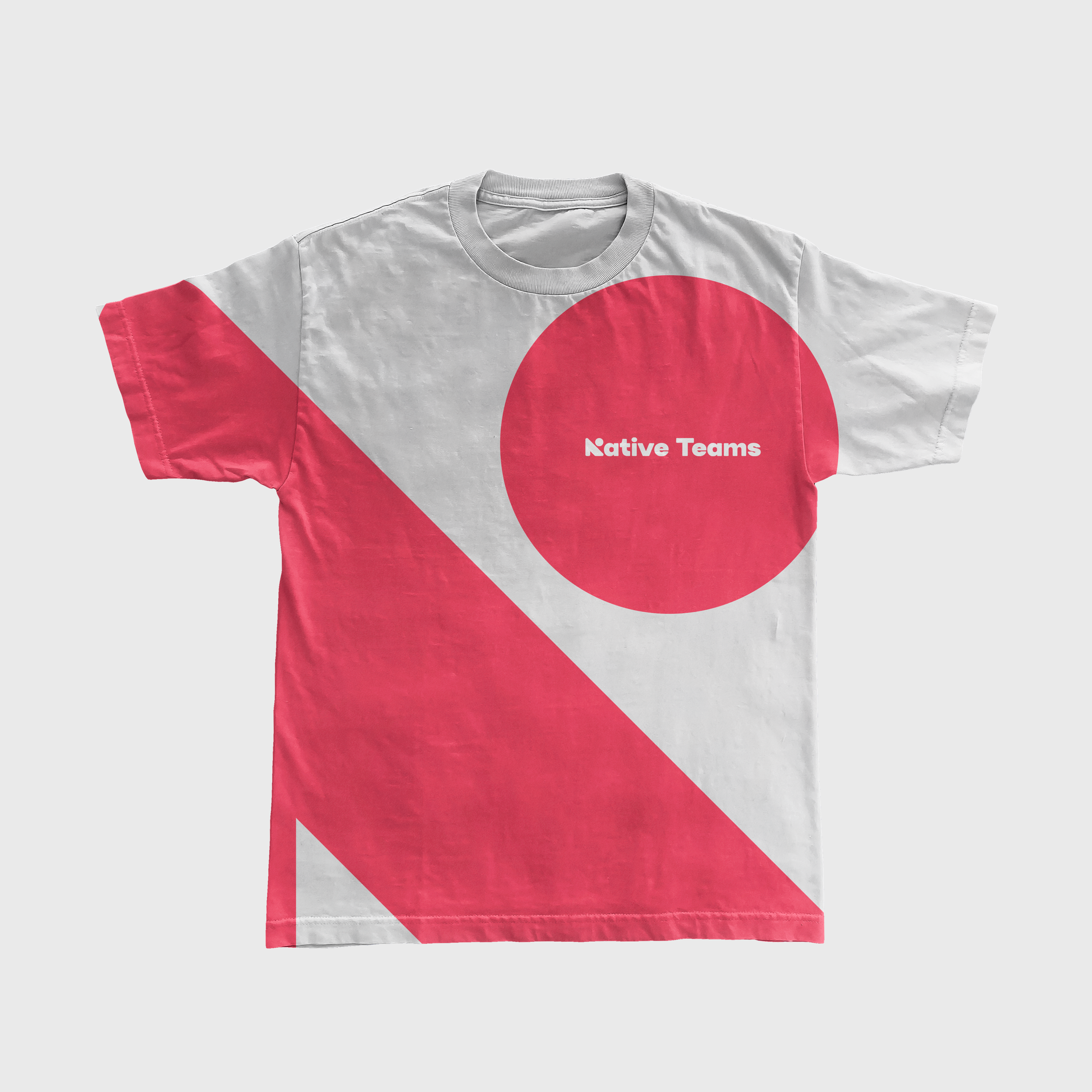
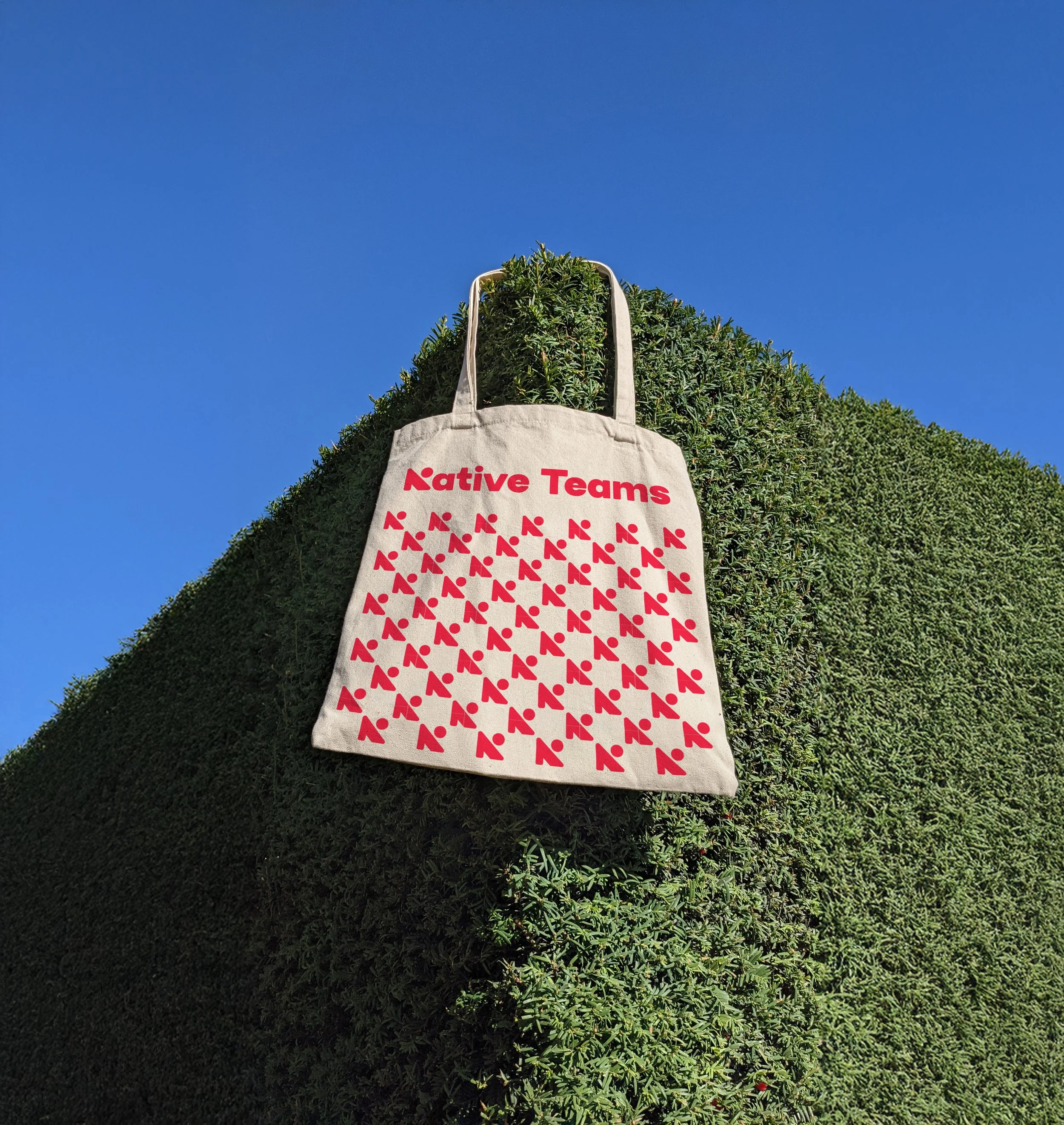
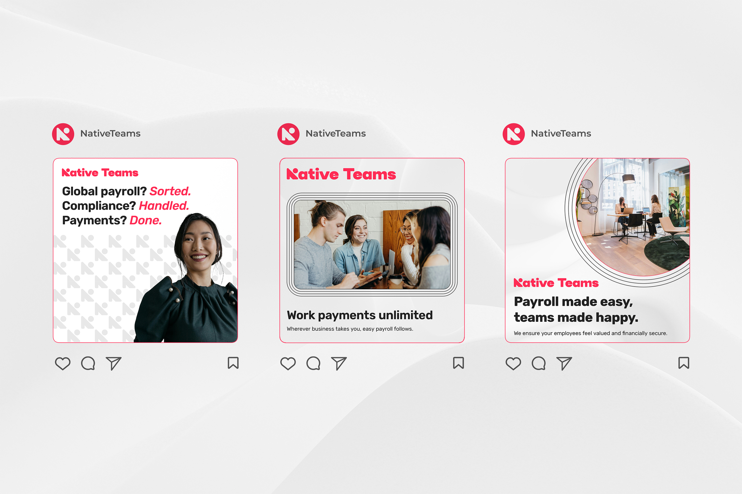
A new logo
A stylised “N” paired with a confident wordmark, versatile enough for everything from app icons to billboards.
Colours
The electric and energising sizzling red became the hero colour, supported by eerie black, pure white, and a fresh, tender turquoise accent.
Typography
Rubik, a clean, modern, and slightly rounded typeface, just like the brand- smart, but approachable.
UI & product palette
Extended colours for digital use that create consistency across the app, web, and marketing.
Photography & graphics
Real people, spontaneity, and elements that bring movement and structure without being too rigid. Warm lighting, clean backgrounds, and diverse presentation, because global means everyone.

The tone of voice was refreshed to be:
Clear and confident:
“Global payroll? Sorted.”
Warm and supportive:
“We’re here to help your team feel valued.”
Backed by facts:
“Trusted by 3K+ companies in 85+ countries.”
No buzzwords. No fluff. Just real talk that builds trust.
The Outcome
The rebrand rolled out across all channels: product, website, social, and onboarding flows, and immediately felt different through:
Stronger emotional connection with both users and partners.
Unified brand experience from the first interaction to the platform itself.
A brand identity that finally lives up to the product.
With this joined rebranding effort, Native Teams now looks and sounds like what it is: a global, empowering, and human-first partner for the future of work.